Finding the Light – album preview

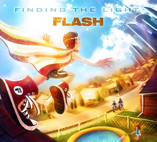
Now that Finding the Light has been mixed and mastered, here’s a six-minute sampler with a little from each track.

Intrigued? I’m anxious for you to take the entire 50-minute journey, because so far only two people have heard it: the mastering engineer and cover artist (the only two roles I delegated).

My next post—very soon—will be to reveal the cover artwork. I’m expecting a mid-September release if everything falls into place. Still got a bunch of flaming hoops to navigate, like the design, manufacturing, publishing, and online stores. At that time I’ll link up a dedicated page with all the info to get it in your CD, download, or streaming library.

This album will need all the promotional help it can get, so I’d appreciate you loosening up those jaws in preparation to spread the Word of mouth … or any other mouth-love you can provide. Thank you, and enjoy!

guitar_pov

Posted in music, news | Tagged , , | Comments Off on Finding the Light – album preview

Album Progress

My lack of recent updates is because historically most of them have been literary, and I’m on hiatus from that world for a bit. (I will, however, be hanging in Minneapolis during AWP, eager to let you buy me drinks.) My stack of unread books grows monthly, as I’ve barely cracked a spine since last summer. But if you figure I’ve gone dormant, perish those thoughts.

I’m recording a new album.

Continue reading
Posted in music | Tagged , , , | Comments Off on Album Progress

Important Question? podcast

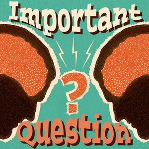
Important QuestionWhat would convince you to eat another human being?

This is our first topic on a new must-listen podcast: Important Question? where we explore and debate such taboos with the profundity and absurdity and hilarity they warrant. Ensuing episodes will examine other grey areas soaking in our collective grey matter, like, I dunno … ruining a child’s Christmas(?) or taking a bullet for a stranger(?).

Alongside myself, the devil’s original advocate (author, BookTuber, marketer) Caleb J Ross brings his perverse wit and flexible morality (and web hosting) to the dialogue. Will it end in aural fisticuffs or virtual high-fives? Who knows. Either way, you’ll come away with the requisite ammunition to argue these topics later with your racist grandmother.

Episodes post weekly or biweekly and are 15-20 minutes: more Adult Swim than sitcom. And yes, that’s me performing the theme song. Find the complete episode guide at ImportantQuestionPodcast.com. Get interactive, Like us on Facebook.com/ImportantQuestion for even more fun media and discussion.

Subscribe with:   google_play_music       

important_question_studio

Visit my archive of podcast appearances here.

Posted in entertainment, humor, multimedia, news | Tagged | Comments Off on Important Question? podcast

Solarcidal Tendencies

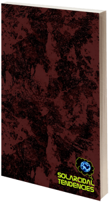
This anthology contains my short story “‘Burgatory” originally published at Solarcide a few years ago, but which has been offline for a while. It’s about a life-insurance salesman facing his mortality as planes of the multiverse collide.

From the publisher:

solarcidal_3dVisions, plagues, angels. A different view of the miracle of birth. Bestiality farms, departing souls, talking cold sores, and of course, elder gods. All of this and more. Edited by Martin Garrity and Nathan Pettigrew, this is a collection of some of the darkest and most peculiar words ever published by Solarcide. The long-awaited return of some of the craziest, funniest, and most brutal fiction that was featured during the first couple of years of the site’s operations. Featuring an introduction by neo-noir road warrior, Richard Thomas, and boasting stories from wonderful folk such as Ben Tanzer, Gordon Highland, Brandon Tietz, Rebecca Jones-Howe, and Garrett Cook. Wicked words are contained within.


Table of Contents:

Introduction – Richard Thomas
Perfectly Natural – Jessica Leonard
Horsepower – Bryan Howie & K. A. Hunter
Child – David Bobis
‘Burgatory – Gordon Highland
A Lady on the Streets – Renee Asher Pickup
Triple Flash – Len Kuntz
Enhancement – Garrett Cook
Distance From Daddy – Rebecca Jones-Howe
Something Special – Ben Tanzer
Carl – Brandon Tietz
Hands and Tendrils – Axel Taiari
The Love – Teri Skultety
The Legend Of Johnny Bell – Laura Andrews
My Life In A Brutalist Concrete Bunker – Tony Rauch
Year of the Pig – Andrea Taylor
Love, Posey – Michael J. Riser


Buy at:   Amazon US    Amazon UK    Createspace

Follow:   Facebook    Twitter    G+

Posted in news, other voices, writing | Tagged | Comments Off on Solarcidal Tendencies

On Rating Books

stars

You may have noticed that I read a lot of four- and five-star books. That’s not me being generous with my ratings, it’s because most were prequalified recommendations from those whose tastes I trust. Neo-noir, crime fiction, southern gothic, literary fiction: these are my preferred genres. I have little interest right now in young adult, sci-fi, fantasy, bizarro, alt-lit, or most of the speculative fictions involving creatures. Exceptions exist, and have certainly provided some eyebrow-raising reads, especially those which transcend or subvert their genre’s prescriptions. But with so many excellent purchased books lying in wait, well … hopefully I’ll live to see retirement (and my eyesight holds up) so that I may partake in new genre adventures.

What does a five-star rating really mean, anyway? That’s it’s a perfect book? No. Even loosely defined, few would be worthy in this reader’s opinion. It means it’s in the top 20th percentile of all books. Four stars would mean it’s better than 60-80% of others. That’s not such rarefied air when you consider the sheer quantity of pulp populating the shelves.

I know a lot of authors. We chat online, socialize at events, even edit each other’s work. Of the 120 to-be-read books on my shelf, 45 are by those I consider friends or peers: most of whom you’re unlikely to find on chain-store shelves, deserving as they may be. Am I biased? Of course! It’s subjective, just like anyone’s reviews. Who knows, my friendship may be worth an extra star, but that’s not to inflate their ratings for marketing purposes, merely my own opinion, which may be subject to influence in the same way you’ll cheer for a local band because you know the bass player. My own books of course receive five self-stars because I wouldn’t have published them were they not my very best effort at that time.

Star ratings in general I only find useful as a consensus just like how I trust Rotten Tomatoes for movies. The detailed reviews are what I read, for context. Even if I rate a book four stars, I’ll still use that opportunity for critique as well as praise. Similarly, reading a two-star review might still get me excited for a book if they detail elements where our tastes differ. When I only leave stars in lieu of a text review, that’s probably for a popular title that’s been sufficiently discussed, where I have nothing new to add. Or it was a bad book that will ultimately die of its own hand without public flogging from me (that’s what happy hour is for). I do wish authors were more willing to be critical of one another’s work these days, but it’s offset by readers having a public voice/platform that used to be the sole domain of journalists. If I’m going to spend the extra energy doing a write-up, it’s probably for an underserved book worth celebrating. Regarding my own titles, I care nothing about ratings, only that readers made an attempt to engage with it and that their analysis is thoughtful, for better or worse.

If you’ve read an indie or small-press author’s work, the best thing you can do for them is to spread the word. Goodreads reviews are appreciated, but what we really want is for you to post on the retailers’ product pages: the point of purchase where many potential readers make their decisions. It requires little effort to copy/paste these across platforms, and can help the author tremendously.

For those unfamiliar with my own work, I recommend starting with my novel Flashover. I also have a collection of stories and verse called Submission Windows, as well as my debut novel, Major Inversions, recently released in audiobook.

Also, it’s Short Story Month (#shortstorymonth)! I’ve read nearly a hundred so far, and encourage you to check out some of the online freebies I’ve linked.


Posted in other voices, writing | Tagged , , | Comments Off on On Rating Books

Major Inversions audiobook

inversions_audible

Remember my debut novel from back in 2009? Ever wanted to cut out the eyeball middlemen and have the author’s voice streaming between your ears handsfree?

Continue reading
Posted in multimedia, music, news, writing | Tagged , , | Comments Off on Major Inversions audiobook

Book Layout Tips

The rise of self-publishing means more authors are taking on unfamiliar roles, with mixed results. To put it kindly. I’ll leave the marketing/promotion advice to others, but one aspect I can speak to with some authority is design. I’ve designed all three of my own books, assisted with several others, and worked on a ton of print jobs in a (miserable) former agency life. My first novel interior was created in Microsoft Word—which I don’t recommend—with decent results. Everything since, I’ve used Adobe InDesign, and Photoshop for any imported raster images.

While I strongly encourage enlisting a pro for design work (cover art at the very least), if you’ve got the tools, a little knowledge, eagle eyes, and a masochistic streak, interior book layout isn’t terribly difficult these days. What follows is far from comprehensive, merely addressing common errors I see in amateur typesetting. As my readers might expect, we’ll begin in the gutter.

InDesign interface: master pages, glyph, headers, text frames


Gutters and margins
Because books are bound, you need to allocate extra space where the pages attach to the spine, else you risk text falling into that crevice and/or cramping readers’ hands. This space is called the gutter: the right margin of the left-facing pages, and the left margin of the rights. If you wanna sling some lingo, we call right pages recto and lefts verso. For a perfectbound (glued) paperback, I recommend adding at least an extra quarter-inch to each. I set all my outside margins at 1/2″ and gutters at 3/4″.

Headers and footers
At the top of each page spread, above the body text margin, you want the author’s name and book title. Doesn’t matter which goes on which side. See every novel in existence for examples. In Microsoft Word, they call this area a header. We also don’t care whether it’s centered or justified to the outside margin. Just be consistent with your choices. Same goes for the page numbers and their placement. I like to use a different font in a lighter shade for my headers. Also, headers don’t belong on the first page of a new chapter.

Using InDesign, we handle all these variations via master pages: layout templates that include any empty or pre-filled text/object frames you wish to repeat. You can set up a left, a right, and a headerless master (for your Sleepy Hollow fanfic), then just drag that master icon onto each page icon to apply the desired layout. Awesomely, you can modify master pages later, which applies those changes to all affected.

When it comes to compilations, between you, me, and this bottle of Gentleman Jack, I think it’s easier to just copy/paste all the headers manually into each page. The current story title replaces the author name, so trying to use master pages would result in so many variations they’re likely not worth it. As for auto-generating page numbers …  I’ll let you Google that one.

Front and back matter
Of course they do (, he claimed in his harassment-suit defense), but we’re talking books here. With the exception of the copyright page, or additional works by, you generally want most of your front matter (everything preceding the beginning of the story: title, epigraph, foreword, etc.) and back matter (endnotes, index, etc.) to begin on a right-facing page rather than the backside of one, which often means inserting some blank pages. E-books have no such distinction, but it’s easy to overlook this in a print layout, especially if you’re working in an app that doesn’t display page spreads.

Glyphs and images
Those little ornamental symbols that denote section breaks? Those are glyphs (or dinkus). Maybe they’re filigree or fleurons. A sword or a tree or a phallus. Hopefully something thematically relevant yet simple and mutable to a tiny size. One thing it’s not is a hash mark. Those are just manuscript placeholders so the designer knows where to put the glyphs later. Leaving a # in a published book is a red flag for amateurism, and a misdemeanor in 37 states. You’ll want to output this graphic with transparency, which means a TIFF for print or a PNG for e-books.

Speaking of section breaks, the first line of a paragraph following one should not be indented (as with the first paragraph of a chapter). The reason for this … hell, I dunno, but probably because some designers simply use extra linespace at a section break in lieu of a glyph, so an unindented paragraph makes these sections easier to spot, especially when one happens to coincide with the top of a new page where you can’t tell whether there was a preceding linespace or not.

As for raster images (stuff made of pixels, like pics), for print, these need to be saved at 300 dpi in Photoshop or the like. I prefer interior images be in grayscale mode, with contrast enhancements to compensate for the lack of color. Import your images into InDesign via the Place command in an object frame (which you can scale, crop, or shape). This will create a linked relationship to the original file, one you can still edit externally. Don’t copy/paste images from their sources, which will only embed them as-are. When exporting your PDF for print, be sure to enable any options for including images at their original resolutions rather than the proxy versions that might’ve appeared in the layout.

Block quotes
Since these are stylistic choices, you can get creative with your inset excerpts. Why not use formatting that mimics the original source? A sans-serif font for web/blog content, for example. A custom cursive font for handwritten notes. Courier for typewritten material. Import it as an image file if need be. I like to inset from the right margin as well as from the left, but that’s your call. If merely centering a single line, or an image (or glyph), be sure to remove its left indent or it’ll be off-center to the right. This error is especially obvious on e-readers, whose lines tend to be shorter. Most block quotes look better with a slightly smaller font than the rest.

I’m a fan of using smallcaps to distinguish text-based visuals (not just inset ones, but anywhere), such as when describing a sign: beware of god. Better than getting screamed at by regular caps. Whenever substituting a font in the middle of a line, make sure it doesn’t affect the leading, or compensate accordingly.

Widows and orphans
Be unsympathetic toward these abandoned bits of text: a lone paragraph-ending line at the top of a new page (widow), or a lone paragraph-beginning line at a bottom (orphan). The way we kill them is by tracking, which means adjusting the spacing between the letters of entire words at a time. At the individual character level, this is called kerning, which you’d only do if a font displays odd letter spacing or overlaps, most noticeable in larger/bold text like chapter titles, or with special characters. For short widows, I usually decrease the tracking of previous lines to snap the widowed one back onto the previous page. Longer widows, I’ll increase tracking to push two lines to the top of the next page instead of one. Since orphans always occupy an entire line, I push them onto the next page unless the previous paragraph ended on a short line. Never use your spacebar or hard returns against widows and orphans, only make tracking adjustments. Life sucks enough for them as it is without you adopting or fostering bad habits.

Oh, and you did set all your body text to Justify Left, yeah? But not Justify All, which would also stretch the final line of a paragraph to the full width of the frame. Check for unnatural hyphenations at the ends of lines, and track them out where possible.

Scrivener interface: chapters, e-book exporter, organizational panes


e-book considerations
Lotsa gotchas to be aware of here. I write my manuscripts in an app called Scrivener, and can’t recommend it enough. Not only does it consolidate your workspace and research into a single interface, its export options are wicked flexible, allowing lots of adjustments without altering the manuscript itself. For our purposes here, it also offers direct export of both MOBI (Kindle) and EPUB (Nook et al.) files. A Scrivener project file is made up of many individual documents, which are easily rearranged. I start a new document for each chapter of a book, from which Scrivener can automatically generate a functional table of contents that links to each. Too many e-books have no ToC, or even chapter stops, and if this is true of a story collection, I won’t buy it. Scrivener also lets you define front matter.

Remember that e-books give the reader control over text size, so the notion of a “page” is nonexistent. It simply keeps flowing (except where there are chapter stops). If you need an image to align with text a certain way, for example, you can’t be sure of what the reader will see. So it may make sense to save certain elements as images, even if text-based. I save my e-book images in color, for those devices that support it, knowing that others will display them as grayscale. The standard Kindle dimensions for book covers is 600×800, so I use that as my basis for a “full page” image, and scale others accordingly (so a glyph might be around 200×20). While it’s possible to embed oversized images the reader can zoom in on if they want, that’s a chore on some devices, so I avoid them. Speaking of glyphs, a good practice is to use an image tag at each instance that points to the glyph file rather than embedding them; that way they’re universally modifiable (and I assume more file-size efficient).

If the plasma or sperm banks reject you (get used to it, writer) and you can’t muster the $45 for Scrivener, you can still create an e-book using a traditional word processor. Just save the doc as filtered HTML and upload that to Amazon KDP. This does a respectable job of retaining your formatting. Or you could use Calibre to convert the HTML to MOBI first, which is helpful if you want to e-mail the book or side-load it to a reader. Calibre can also create an EPUB from HTML. Don’t forget to first create a ToC in Word.

Story time: When I created my most recent EPUB in Scrivener, it generated a gorgeous file that tested flawlessly in my previewer (Adobe Digital Editions), but apparently Nook Press (Barnes and Noble) modifies this file somehow upon upload, and it displayed quite fuckedly in their online proofer. After about ten more exports proved futile, I ended up reformatting much of the book (chapter stops and ToC, especially) in their online editor, which works well, but was ulcer-inducing for a collection with 78 “chapters.” No issues with the Kindle Edition. I use an app called Kindle Previewer to test those, and do so across multiple devices in their product line at both medium and small text sizes to check for any flow issues. Usually there are a handful of minor details for me to fix.

My own design process
I create e-books before their print counterparts, because 1) it’s relatively quick, and 2) sometimes I’ll catch a few overlooked editorial errors, and since I’m still working directly in the manuscript, I only need to change them in one file. I then copy/paste the entire text from Scrivener into InDesign (after setting up hundreds of pages of linked text frames to contain it all). The good news is most of the linespacing/leading and indents survive intact. The bad news is you lose all text formatting. I literally labor sentence by sentence to re-italicize and bold everything while referencing the original manuscript. It’s incredibly tedious, taking me two to three days for the entire typesetting job, during which I emanate irritability, swampass, and a dead-eyed glaze to rival the most jaded porn stars. UPDATE: The knowledgeable Christine Keleny has informed me that InDesign allows you to Place RTF files, which will retain their manuscript formatting and possibly delay your institutional commitment.

Always work chronologically from the first page to the last, because with linked text frames, there are no hard page breaks. Whenever you enlarge a chapter title, insert images, or even italicize a phrase, those affect spacing, reflowing everything that follows in a domino (butterfly?) effect. Same goes for widows and orphans: save yourself a lot of rework by sparing their lives until after everything in a chapter has been formatted and sized. I complete all the typesetting for a chapter before moving on to the next one. Except for the page numbers in the table of contents, because obviously these change as you go. I’m also looking for font substitution opportunities like smallcaps or inset passages, unwanted blank lines at page bottoms, consistency with chapter title placement, header accuracy, and text frames that might’ve gotten nudged out of position.

Benediction
My goal is to have my self-published books appear indistinguishable from the large press titles on the shelf. Hopefully these tips will help a few others do the same, because I just hate seeing great stories undermined by lousy design. My eyes thank you, as does my bloated Kindle. Don’t make me come over there and not read you. That’s all I can think of for now. Please do share this post, and feel free to keep it going in the comments.


______________________
Gordon Highland is the author of the new collection Submission Windows: stories and verse, as well as the novels Flashover and Major Inversions.

Posted in multimedia, writing | Tagged , , , | 4 Comments

Favorite Reads of 2013

bookshelf2013

I managed to consume 32 books this year. Most came from small presses, and were quite good. Plenty has already been said about the big titles, so I focus on reviewing the underserved authors worthy of your attention. Because I’m lucky to get my book recommendations from readers with similar tastes (and because my to-read pile numbers in the hundreds, allowing little patience for lousy reads), it’s time well-spent, with a high signal:noise ratio. These are the books that got me talking this year—yes, many of them written by people I know.


The Cost of Living – Rob Roberge

It refused to be put down. I read it in one day—one itchy, bloodshot, selfish, nostalgic, regretful, guilty, euphoric, and glorious day. Our guy in yet another hard-earned recovery faces the pressures of reuniting with his glory-days band and its attendant temptations of relapse while in a showdown with his estranged, dying father still mum about the mother who disappeared long ago. Roberge’s writing is always sharp, witty, and pacey, but never more poignant and affecting than it is here.


Junkie Love – Joe Clifford

I’d feel less guilty for liking this book so much were it not true. Some passages are matter-of-fact, while others are more fanciful literary flights (I’ll let you guess which ones are about scrapping for dope versus shooting it). It’s an apt title, as Clifford often equates or conflates his heroin highs with those of female affections any given week. Some protagonists frustrate me with their endless failings to do the right thing until it’s too late in the story, but I had no such issue here, knowing that junkies never really kick, tempering my expectations and leaving them open for anything to happen. Junkie Love will surprise you both in its depths and heights of human behavior. Repeatedly.


We Live Inside You – Jeremy Robert Johnson

We meaning these stories. It’s a compliment when I say I wouldn’t want any of these characters’ lives, however vicariously I may’ve enjoyed them for 15 minutes a pop. JRJ’s one of my favorite writers, losing nothing since his previous collection, with a language focus that elevates his work above most of his peers. These tales are bodily, conspiratorial, darkly comic, and often experimental. They’ll find you squirming while at the same time looking around to see if anyone suspects the involuntary grin living inside you.


Blackbirds – Chuck Wendig

Wendig is a master of inventive cursing, for which his character Miriam Black is an ideal foil: a hard-living hot mess of a fatale with a “gift” for seeing people’s death upon skin contact with them (I wonder if she knows Tobe Mohr from my novel Flashover …). This evolves from a begrudged method for her to make a quick robbery buck into something personal, maybe even dutiful. It’s a plotty page-turner perfectly balanced with visual descriptions, and a flair for clever simile. Yeah, Miriam does read like a guy much of the time—which she’d probably kick my ass for saying, and then steal the bacon off my plate and my car off the lot—or maybe we’re just not used to such unfiltered women.

I immediately burned through through Mockingbird, the follow-up (nearly as good, though Kindle typos abound—strange, given the popularity of Wendig’s prolific and hilarious writing/publishing advice), and await her next adventure, The Cormorant, mere hours from now. I can’t honestly remember the last time I read a series. There was the Phineas Poe trilogy by Will Christopher Baer, which are among my favorite all-time novels, and I guess the John Dies ones, which have their moments. And someday I want to get to Lansdale’s Hap and Leonard series. But I’ll keep riding shotgun with Miriam as long as she’ll have me.


Angel Falls – Michael Paul Gonzalez

There’s a talking monkey. Nuff said.

Monkey is also the wheelman, the wisecracking, womanizing, doubly-immortal sidekick who saves the day more than once, all while shuttling Lucifer and his ragtag posse from one adventure to the next in an underworld race to the Pearly Gates to thwart a cunning demon from executing a Heavenly coup. Think Kevin Smith’s Dogma through the lens of Christopher Moore’s best satire, with a lot more CGI.

Our (anti-?)hero Lucifer has Hell running pretty much the way he likes it, delegating its regional management to a variety of untrustworthy entities we meet along the way. As with the sarcastic, lazy narrator, Gonzalez imbues these iconic characters with insecurities, multiple personalities, addiction, and wry wit. It’s a classically-structured epic, a journey populated with enablers and obstructers and mentors and princesses. And like Bill Cosby always reminded us kids, “if you’re not careful, you may learn something before it’s done.” It’s staggering, the amount of research this beast must’ve required, as most of it is rooted in canonical myth.

Also impressive is the level of detail in the often-ethereal surroundings: rivers and chasms and skies that morph in all manners of unholy transience. It can be disorienting in spots, yet effective when you consider the characters are equally stupefied. Don’t get comfy in any one location, and trust no one.

Gonzalez’s vision of Hell mirrors our top-side lifestyles, enabling a layer of social commentary that provides some of its best moments, whether that’s the dregs of being condemned to a service-industry job, the long, vindictive memories of spurned lovers, or vapid reality-TV stars and their purse-dogs. We all make the Long Walk alone, but Angel Falls is a happening place to kill some time after death. And try the manna cakes at The Garden of Eatin’; they’re divine.


Flushboy – Stephen Graham Jones

You thought your teen years were awkward, imagine working the window of your family’s drive-thru urinal business. This novel is about as high-concept as Jones gets, and he covers it from every conceivable angle, damn-near well enough to submit a business plan. It’s a unique framing device for exploring otherwise-typical teen angst: chercher la femme and getting out from under your ambitious, near-beer-guzzling father’s thumb. Most of Jones’s books I recommend reading quickly, given their density and complexity, but Flushboy, though simpler in many ways, I had to take in trickles (by which I don’t mean 20 seconds at a time, standing, using my free hand), because over extended periods, its pervasive urine vapors can begin clouding your lungs. Painfully funny stuff, and the narrative adolescent voice is spot-on.


Country Hardball – Steve Weddle

A great read, with lots of heart and just enough grit to sate fans of modern hick-lit. It was actually refreshing that so much of its violence occurred off the page and kept us focused on the interactions of its cast, giving the book more humanity than some of its peers as it dealt more with the aftermath of tragedy or the circumstances that lead to bad behavior rather than just the spectacle of them. I had trouble in spots keeping up with all the characters, which I attribute to its short-story origins, where each chapter would need to stand alone; but compiled, there are a lot of subplots and family trees to track. And of course baseball analogies abound.


May We Shed These Human Bodies – Amber Sparks

Sparks uses some very creative mechanisms for compartmentalizing the sections in these stories, like lists or ingredients or itineraries. I did occasionally grow weary of such methods (seeming like writing-exercise prompts), but overall they enhanced my enjoyment of the stories within them. There were many gorgeous and insightful lines I found myself rereading in awe. She often employs a fairy-tale-like rhythm with a simplicity and repetition that lends those stories an objectivity I found pleasant, on multiple occasions referring to characters as “the mother” or “the father,” etc. A few of the more surreal bits weren’t to my personal tastes, but still well done. Unfortunately, the Kindle Edition has no functional ToC, which should be mandatory, especially for story collections.


The Tiny Book of Tiny Stories: Vol. 3 – hitRECord

Adorable. While reading, I pictured Zooey Deschanel strumming a uke in the corner. I’m a big fan of microfiction, and these entries curated from Joseph Gordon Levitt’s hitRECord community (80,000 strong) allow the reader to unpack their own notions of what these li’l fictions hint at. It’s participatory. The accompanying artwork here is the best of the three hardcover volumes, and serves to offer one—often unexpected—interpretation of each. I wish all three volumes were collected into a single, more substantial work, but that would kinda defeat the purpose.


Cipher Sisters – various

Another good-looking book from ThunderDome Press. They always have such cool print designs. This themed anthology has its contributors speculating about real-life mysterious twins found dead with no claiming kin or record of their existence. Many authors chose the vaudevillian, carnivalesque path, which I’d expected (would be tough to resist). Most also crafted opposing personalities for the sisters, for contrast, though others used their identicality to more ambiguous effect. On any given cluster of pages, they might be promiscuous, demure, or conniving. There were a few mediocre entries, and a couple whose overwrought prose prevented me from investing in their stories, but most were creative interpretations I enjoyed muchly. The highlight for me was a three-story stretch of “The Cipher Sisters and Kid Nosferatu Dance the Bally-Kootch” by Edward Morris, Amanda Gowin’s “Asymmetry,” and “Darcy and Lucy Among the Flowers” by Andrew Davis.


With an obvious bias due to my participation, here are two more 2013 anthologies I loved.

The Booked. Anthology – various

Even if I didn’t have a story in here, or hadn’t met and caroused with 17 of its contributors at some point or other, the ultimate rating would stand. These authors will kick your ass, break your heart, and have you thanking them for it. Smart storytelling with wicked prose chops. Most of them lean dark, whether classic- or neo-noir, domestic, lit-fic, sci-fi, or bizarro. All-new stories; no reprints here. Each contributor has been a guest of the namesake podcast during its 180+ episode history, which is a unique criterion for an anthology, especially given how cohesive the result reads. Odds are good that Booked has reviewed something you’re thinking about reading, or talked to your favorite authors, dropping some knowledge and smack and hilarity in the process.

There were only a few stories I didn’t care for, though I’ve no doubt they’d appeal to other readers in their genres. A few highlights for me were Paul Tremblay’s “Scenes From the City of Garbage and the City of Clay,” with its grimy, cinematic depictions of 1970s New York City; “Short Tendon” by Amanda Gowin, whose surreal prose renders a technology-vs-nature competition for a neighborhood’s vanity; “Surrender,” a horror-house tale by Richard Thomas, whose patriarch character’s suffering may be of his own making; and Fred Venturini’s “A Pound of Flesh,” which kicks things off and sets the bar with a home invasion culminating in a brutal dilemma.

Not only does Booked tell you what to read, now they publish what you read.


The Tobacco-Stained Sky: An Anthology of Post-Apocalyptic Noir – various

What I find most fascinating about this anthology is the amount of crossover in equal measure with originality. Each story inhabits the same fictional universe established in Tobacco-Stained Mountain Goat, but that source novel obviously still left enough to the imagination to allow for all the variations you’ll find here. There are always Deviants pursued by Seekers (and we ride along with characters on both sides of the law), and always the haves and have-nots who either inhabit the Dome or endure the toxic rainwater outside. But it’s fun to read each author’s creative interpretation of all its tangential elements, like cosmetic surgery innovations, virtual-reality gaming, political machinations, or even the underground milk trade. Like a really long deleted-scenes reel from your favorite DVD.

The book is violent, hilarious, colloquial, nostalgic, manipulative, and probably some other Australian adjectives I’d need a glossary for. Graphic-story interstitials break things up frequently, and while I marveled at the stylistic diversity of artwork and panels, their small print makes some of those hard to read. I digested this anthology slowly, one story at a time (it helps to clear your mental palate after each), and was highly entertained.


______________________
Gordon Highland is the author of the new collection Submission Windows: stories and verse, as well as the novels Flashover and Major Inversions.

Posted in entertainment, other voices, writing | 4 Comments

LitReactor Community Spotlight

G_fivenapkin

I’m the focus of this month’s Community Spotlight over at the excellent LitReactor, profiled by Jessica Taylor. The main topic is Submission Windows, my shorts collection, but the interview also delves into the art of sequencing compilations, poetry, and the differences between writing for the short versus long form.

LitReactor is one of the most popular book/writing sites out there, with columns, interviews, online courses, and an enormous community forum (I’ve been active since day one), whose members Jessica has taken the initiative to feature. Recent Spotlights have profiled Chris Lewis Carter, Pantheon Magazine, Solarcide, David Buglass, and Jonathan Riley. Jessica also co-hosts Books and Booze, a weekly podcast featuring author interviews and discussion.

Posted in news, writing | Comments Off on LitReactor Community Spotlight