The rise of self-publishing means more authors are taking on unfamiliar roles, with mixed results. To put it kindly. I’ll leave the marketing/promotion advice to others, but one aspect I can speak to with some authority is design. I’ve designed all three of my own books, assisted with several others, and worked on a ton of print jobs in a (miserable) former agency life. My first novel interior was created in Microsoft Word—which I don’t recommend—with decent results. Everything since, I’ve used Adobe InDesign, and Photoshop for any imported raster images.
While I strongly encourage enlisting a pro for design work (cover art at the very least), if you’ve got the tools, a little knowledge, eagle eyes, and a masochistic streak, interior book layout isn’t terribly difficult these days. What follows is far from comprehensive, merely addressing common errors I see in amateur typesetting. As my readers might expect, we’ll begin in the gutter.

Gutters and margins
Because books are bound, you need to allocate extra space where the pages attach to the spine, else you risk text falling into that crevice and/or cramping readers’ hands. This space is called the gutter: the right margin of the left-facing pages, and the left margin of the rights. If you wanna sling some lingo, we call right pages recto and lefts verso. For a perfectbound (glued) paperback, I recommend adding at least an extra quarter-inch to each. I set all my outside margins at 1/2″ and gutters at 3/4″.
Headers and footers
At the top of each page spread, above the body text margin, you want the author’s name and book title. Doesn’t matter which goes on which side. See every novel in existence for examples. In Microsoft Word, they call this area a header. We also don’t care whether it’s centered or justified to the outside margin. Just be consistent with your choices. Same goes for the page numbers and their placement. I like to use a different font in a lighter shade for my headers. Also, headers don’t belong on the first page of a new chapter.
Using InDesign, we handle all these variations via master pages: layout templates that include any empty or pre-filled text/object frames you wish to repeat. You can set up a left, a right, and a headerless master (for your Sleepy Hollow fanfic), then just drag that master icon onto each page icon to apply the desired layout. Awesomely, you can modify master pages later, which applies those changes to all affected.
When it comes to compilations, between you, me, and this bottle of Gentleman Jack, I think it’s easier to just copy/paste all the headers manually into each page. The current story title replaces the author name, so trying to use master pages would result in so many variations they’re likely not worth it. As for auto-generating page numbers … I’ll let you Google that one.
Front and back matter
Of course they do (, he claimed in his harassment-suit defense), but we’re talking books here. With the exception of the copyright page, or additional works by, you generally want most of your front matter (everything preceding the beginning of the story: title, epigraph, foreword, etc.) and back matter (endnotes, index, etc.) to begin on a right-facing page rather than the backside of one, which often means inserting some blank pages. E-books have no such distinction, but it’s easy to overlook this in a print layout, especially if you’re working in an app that doesn’t display page spreads.
Glyphs and images
Those little ornamental symbols that denote section breaks? Those are glyphs (or dinkus). Maybe they’re filigree or fleurons. A sword or a tree or a phallus. Hopefully something thematically relevant yet simple and mutable to a tiny size. One thing it’s not is a hash mark. Those are just manuscript placeholders so the designer knows where to put the glyphs later. Leaving a # in a published book is a red flag for amateurism, and a misdemeanor in 37 states. You’ll want to output this graphic with transparency, which means a TIFF for print or a PNG for e-books.
Speaking of section breaks, the first line of a paragraph following one should not be indented (as with the first paragraph of a chapter). The reason for this … hell, I dunno, but probably because some designers simply use extra linespace at a section break in lieu of a glyph, so an unindented paragraph makes these sections easier to spot, especially when one happens to coincide with the top of a new page where you can’t tell whether there was a preceding linespace or not.
As for raster images (stuff made of pixels, like pics), for print, these need to be saved at 300 dpi in Photoshop or the like. I prefer interior images be in grayscale mode, with contrast enhancements to compensate for the lack of color. Import your images into InDesign via the Place command in an object frame (which you can scale, crop, or shape). This will create a linked relationship to the original file, one you can still edit externally. Don’t copy/paste images from their sources, which will only embed them as-are. When exporting your PDF for print, be sure to enable any options for including images at their original resolutions rather than the proxy versions that might’ve appeared in the layout.
Block quotes
Since these are stylistic choices, you can get creative with your inset excerpts. Why not use formatting that mimics the original source? A sans-serif font for web/blog content, for example. A custom cursive font for handwritten notes. Courier for typewritten material. Import it as an image file if need be. I like to inset from the right margin as well as from the left, but that’s your call. If merely centering a single line, or an image (or glyph), be sure to remove its left indent or it’ll be off-center to the right. This error is especially obvious on e-readers, whose lines tend to be shorter. Most block quotes look better with a slightly smaller font than the rest.
I’m a fan of using smallcaps to distinguish text-based visuals (not just inset ones, but anywhere), such as when describing a sign: beware of god. Better than getting screamed at by regular caps. Whenever substituting a font in the middle of a line, make sure it doesn’t affect the leading, or compensate accordingly.
Widows and orphans
Be unsympathetic toward these abandoned bits of text: a lone paragraph-ending line at the top of a new page (widow), or a lone paragraph-beginning line at a bottom (orphan). The way we kill them is by tracking, which means adjusting the spacing between the letters of entire words at a time. At the individual character level, this is called kerning, which you’d only do if a font displays odd letter spacing or overlaps, most noticeable in larger/bold text like chapter titles, or with special characters. For short widows, I usually decrease the tracking of previous lines to snap the widowed one back onto the previous page. Longer widows, I’ll increase tracking to push two lines to the top of the next page instead of one. Since orphans always occupy an entire line, I push them onto the next page unless the previous paragraph ended on a short line. Never use your spacebar or hard returns against widows and orphans, only make tracking adjustments. Life sucks enough for them as it is without you adopting or fostering bad habits.
Oh, and you did set all your body text to Justify Left, yeah? But not Justify All, which would also stretch the final line of a paragraph to the full width of the frame. Check for unnatural hyphenations at the ends of lines, and track them out where possible.

e-book considerations
Lotsa gotchas to be aware of here. I write my manuscripts in an app called Scrivener, and can’t recommend it enough. Not only does it consolidate your workspace and research into a single interface, its export options are wicked flexible, allowing lots of adjustments without altering the manuscript itself. For our purposes here, it also offers direct export of both MOBI (Kindle) and EPUB (Nook et al.) files. A Scrivener project file is made up of many individual documents, which are easily rearranged. I start a new document for each chapter of a book, from which Scrivener can automatically generate a functional table of contents that links to each. Too many e-books have no ToC, or even chapter stops, and if this is true of a story collection, I won’t buy it. Scrivener also lets you define front matter.
Remember that e-books give the reader control over text size, so the notion of a “page” is nonexistent. It simply keeps flowing (except where there are chapter stops). If you need an image to align with text a certain way, for example, you can’t be sure of what the reader will see. So it may make sense to save certain elements as images, even if text-based. I save my e-book images in color, for those devices that support it, knowing that others will display them as grayscale. The standard Kindle dimensions for book covers is 600×800, so I use that as my basis for a “full page” image, and scale others accordingly (so a glyph might be around 200×20). While it’s possible to embed oversized images the reader can zoom in on if they want, that’s a chore on some devices, so I avoid them. Speaking of glyphs, a good practice is to use an image tag at each instance that points to the glyph file rather than embedding them; that way they’re universally modifiable (and I assume more file-size efficient).
If the plasma or sperm banks reject you (get used to it, writer) and you can’t muster the $45 for Scrivener, you can still create an e-book using a traditional word processor. Just save the doc as filtered HTML and upload that to Amazon KDP. This does a respectable job of retaining your formatting. Or you could use Calibre to convert the HTML to MOBI first, which is helpful if you want to e-mail the book or side-load it to a reader. Calibre can also create an EPUB from HTML. Don’t forget to first create a ToC in Word.
Story time: When I created my most recent EPUB in Scrivener, it generated a gorgeous file that tested flawlessly in my previewer (Adobe Digital Editions), but apparently Nook Press (Barnes and Noble) modifies this file somehow upon upload, and it displayed quite fuckedly in their online proofer. After about ten more exports proved futile, I ended up reformatting much of the book (chapter stops and ToC, especially) in their online editor, which works well, but was ulcer-inducing for a collection with 78 “chapters.” No issues with the Kindle Edition. I use an app called Kindle Previewer to test those, and do so across multiple devices in their product line at both medium and small text sizes to check for any flow issues. Usually there are a handful of minor details for me to fix.
My own design process
I create e-books before their print counterparts, because 1) it’s relatively quick, and 2) sometimes I’ll catch a few overlooked editorial errors, and since I’m still working directly in the manuscript, I only need to change them in one file. I then copy/paste the entire text from Scrivener into InDesign (after setting up hundreds of pages of linked text frames to contain it all). The good news is most of the linespacing/leading and indents survive intact. The bad news is you lose all text formatting. I literally labor sentence by sentence to re-italicize and bold everything while referencing the original manuscript. It’s incredibly tedious, taking me two to three days for the entire typesetting job, during which I emanate irritability, swampass, and a dead-eyed glaze to rival the most jaded porn stars. UPDATE: The knowledgeable Christine Keleny has informed me that InDesign allows you to Place RTF files, which will retain their manuscript formatting and possibly delay your institutional commitment.
Always work chronologically from the first page to the last, because with linked text frames, there are no hard page breaks. Whenever you enlarge a chapter title, insert images, or even italicize a phrase, those affect spacing, reflowing everything that follows in a domino (butterfly?) effect. Same goes for widows and orphans: save yourself a lot of rework by sparing their lives until after everything in a chapter has been formatted and sized. I complete all the typesetting for a chapter before moving on to the next one. Except for the page numbers in the table of contents, because obviously these change as you go. I’m also looking for font substitution opportunities like smallcaps or inset passages, unwanted blank lines at page bottoms, consistency with chapter title placement, header accuracy, and text frames that might’ve gotten nudged out of position.
Benediction
My goal is to have my self-published books appear indistinguishable from the large press titles on the shelf. Hopefully these tips will help a few others do the same, because I just hate seeing great stories undermined by lousy design. My eyes thank you, as does my bloated Kindle. Don’t make me come over there and not read you. That’s all I can think of for now. Please do share this post, and feel free to keep it going in the comments.
______________________
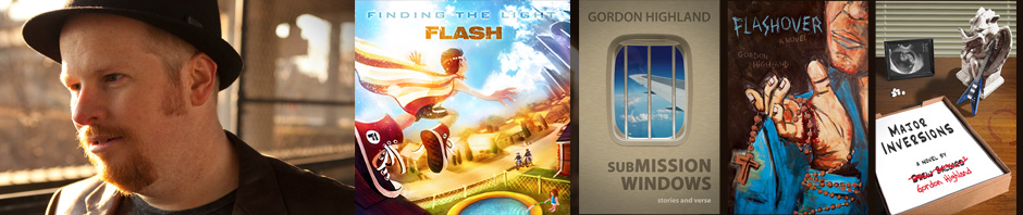
Gordon Highland is the author of the new collection Submission Windows: stories and verse, as well as the novels Flashover and Major Inversions.


Thanks for this– I just learned a ton of useful stuff, and recognized a couple of my own bad habits. I hate designing and it doesn’t come naturally to me at all; I will definitely be coming back to this.
Good to hear it, Jason. Can’t wait to read a book by you!
Thanks for the article. It was very useful. Though I know it takes time from my writing, I love designing the book interior.
Are there any things that really set a good designer apart from a meh one? What would be the Apple of interior book design?
I’m sure there are many wonderful examples when it comes to coffee-table books, art books, maybe even some textbooks. But I was just approaching this one from a simple fiction-writing standpoint with very little visual interior design, since that’s what most self-publishers I know write. Nothing really stands out to me in that regard, because it’s invisible when done well and only grabs attention when flawed. Off the top of my head, After the People Lights Have Gone Off by Stephen Graham Jones looks great, as does that Tiny Book of Tiny Stories series, and Cipher Sisters has this cool two-way fore edge illusion. Of course, there’s the legendary House of Leaves, which took visual metafiction to absurd levels, as well as Caleb J Ross’s As a Machine and Parts for more of a homegrown feel. I couldn’t tell you from memory whether or not those books did the fundamentals well (the stuff I talked about in this article), I just remember them being visually interesting for fiction.